Have you ever wondered why you’re drawn to certain cute planners and productivity tools over others? Or why that kawaii budget tracker might actually help you save more money than a plain spreadsheet? There’s fascinating psychology behind why visually appealing planners and trackers aren’t just pretty – they’re actually more effective at helping you accomplish your goals.
First Impressions Happen in Milliseconds
When you first see a cute planner or tracker, your brain forms an impression almost instantly. Research shows that aesthetic impressions form within 300-600 milliseconds of seeing a design (Höfel & Jacobsen, 2007; Lindgaard et al., 2006). That’s faster than you can consciously think “that’s cute!” This lightning-fast judgment sets the tone for your entire relationship with your planning tools.
Think about it: which planner are you more likely to open regularly – the plain black notebook or the one with adorable matcha-themed graphics that makes you smile? The answer might seem obvious, but there’s science explaining why.
The Emotional Connection to Visual Design
The kawaii aesthetic in Your Digital Brain planners isn’t just decorative – it creates an emotional connection to your productivity system. Design psychology examines how visual elements affect emotions, perceptions, and behaviors by combining principles from psychology with design theory (Roozrang, 2024).
Those cute graphics and soft color palettes in products like the Premium Matcha Budget Tracker aren’t random style choices. They’re carefully designed to evoke specific emotional responses:
- Happiness and motivation: Cheerful designs in cute planners trigger positive emotions that make planning feel rewarding
- Reduced stress: Soft colors and playful elements can lower anxiety around tasks like budgeting
- Personal connection: Themed designs help you form an emotional bond with your planning system
As research from the Institute of Data (2024) points out, “By carefully selecting the colour palette for a design, designers can influence the emotional response of users and shape their overall perception of the product or service being offered.”
Why Cute Planners Translate to Perceived Value
When you invest in a beautifully designed cute planner, you’re not just paying for aesthetics – you’re investing in a tool you’ll actually use. Research has confirmed that users think about a product and its price only when the product arouses their attention or emotion (Norman, 2004; Diefenbach & Hassenzahl, 2011).
Multiple studies have demonstrated that design aesthetics serve as important extrinsic cues that help people evaluate quality and form price expectations (Orth & De Marchi, 2007; Shi et al., 2021). This explains something many of us intuitively understand: a visually appealing kawaii planner feels more valuable, which means:
- You’re more likely to use it consistently
- You perceive the information within it as more important
- You take your planning practice more seriously
Color Psychology in Cute Planners and Digital Trackers
The color choices in your cute planner aren’t just pretty – they’re powerful psychological tools:
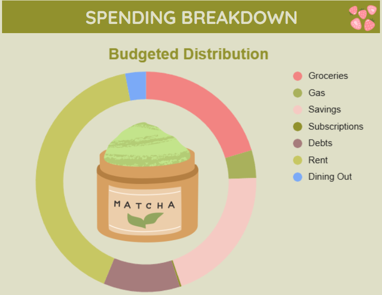
- Green (like in our Matcha theme): Represents growth, balance, and is associated with financial wellness
- Blues: Promote calm and focus, perfect for concentration-heavy tasks
- Warm colors: Create energy and excitement, great for goal-setting sections
- Pastel versions: Soften the psychological impact, creating a gentle motivational effect
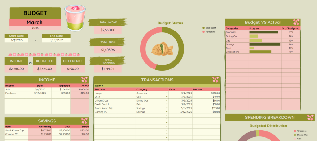
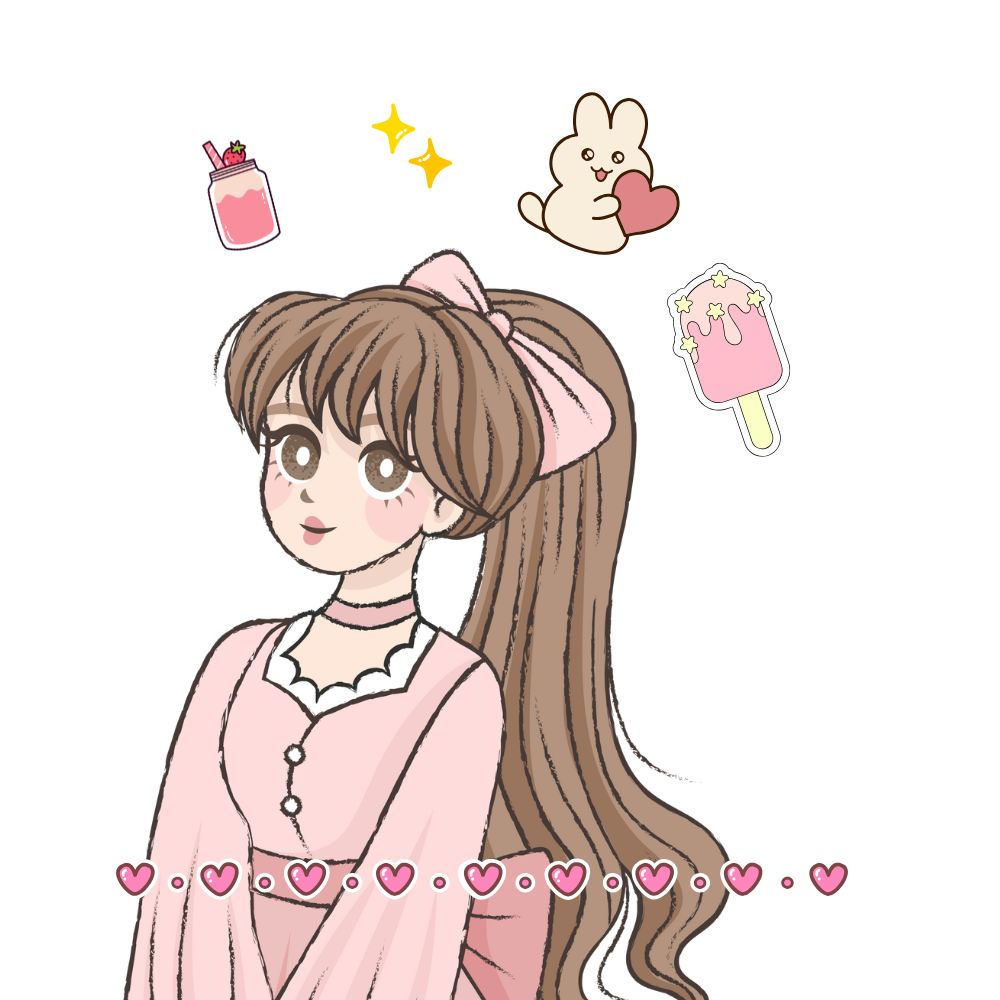
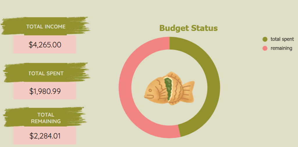
This is why many digital planners with kawaii aesthetics use specific color schemes to enhance productivity. Your Premium Matcha Budget Tracker uses soothing green tones specifically because of their psychological association with growth and financial wellness, making budgeting feel less stressful and more nurturing.
The Science of Organization Aesthetics in Cute Planners
There’s a reason why the layout and visual structure of cute planners matter so much. Humans naturally seek boundaries, both physical and psychological, to help manage attention and focus (Office Work Design, 2024). Well-designed kawaii planners provide these boundaries through:
- Clear visual hierarchy that guides your eye to important information
- Consistent color-coding that reduces cognitive load
- Thoughtful spacing that prevents overwhelm
- Playful elements that make transitions between planning sections more enjoyable
Research on visual hierarchy demonstrates that well-designed visual hierarchy guides users’ attention towards the most important elements and helps convey the intended message effectively (Institute of Data, 2024). Designers of cute planners achieve this by strategically using size, color, contrast, and placement to make planning more intuitive and less intimidating.
The “Kawaii Effect” on Productivity with Cute Planners
The cute aesthetic isn’t just appealing – it can actually improve how you interact with your planning tools. Studies on the “kawaii effect” suggest that exposure to cute imagery can improve attention to detail and concentration on tasks requiring careful behavior (Nittono et al., 2012).
According to research by Palmer and Shimamura from the University of Berkeley, aesthetic preferences are directly related to knowledge and experiences stored in memories (Paloian, 2022). When you use a kawaii-themed planner like the Ultimate Travel Planning Workbook, those adorable travel graphics aren’t just decorative. They’re actually priming your brain for the careful, detailed planning required for a successful trip.
Why the Digital Format Enhances the Effect of Cute Planners
Digital cute planners offer unique advantages that enhance the psychological benefits of good design:
- Interactive elements create more engagement with your planning process
- Color versatility allows for perfect psychological calibration to your personal preferences
- Customization options strengthen personal connection to your planning system
- Accessibility features reduce barriers to consistent use of your cute planner
As recent trends show, digital planners with cute aesthetics are particularly popular because they combine the psychological benefits of adorable visuals with the convenience of digital tools. This explains why kawaii-themed planners continue to dominate the digital planning space in 2025.
Implementing Psychology-Based Design in Your Cute Planning System
Want to harness the power of design psychology in your planning practice? Here are some actionable tips for choosing and using cute planners:
- Choose cute planners that spark joy – the emotional connection will improve consistency
- Pay attention to how different colors affect your mood while planning
- Use visually distinct sections for different types of planning activities
- Incorporate small rewarding visual elements as you complete tasks
The best cute planners aren’t just visually appealing – they’re designed with these psychological principles in mind. That’s why Your Digital Brain’s planners combine adorable kawaii aesthetics with thoughtful organization systems.
The Bottom Line: Cute Planners Are Scientifically Better
The next time someone suggests your kawaii planner is just about aesthetics, you can confidently explain that there’s serious psychology behind those cute designs. The aesthetics of a product have a major influence on its first impression on the user (Diefenbach & Hassenzahl, 2011), and that impression drives consistent use and effectiveness.
Your beautifully designed cute planner isn’t just pretty to look at – it’s a psychologically optimized tool that helps you think better, plan more effectively, and ultimately accomplish more of what matters to you.
Ready to experience the power of psychology-based planner design? Explore our Ultimate Travel Planning Workbook or Premium Matcha Budget Tracker and discover how beautiful planning tools can transform your productivity.
Want more insights on making productivity beautiful? Visit our blog at buildyourdigitalbrain.com for weekly articles on digital planning, organization, and productivity.
References
Diefenbach, S., & Hassenzahl, M. (2011). The aesthetics of a product have a major influence on its first impression on the user. Frontiers in Psychology.
Höfel, L., & Jacobsen, T. (2007). Electrophysiological indices of processing aesthetics: Spontaneous or intentional processes? International Journal of Psychophysiology.
Institute of Data (2024). Exploring design psychology: Understanding the psychology behind effective design.
Lindgaard, G., Fernandes, G., Dudek, C., & Brown, J. (2006). Attention web designers: You have 50 milliseconds to make a good first impression! Behaviour & Information Technology.
Nittono, H., Fukushima, M., Yano, A., & Moriya, H. (2012). The power of kawaii: Viewing cute images promotes a careful behavior and narrows attentional focus. PLOS ONE.
Norman, D. A. (2004). Emotional design: Why we love (or hate) everyday things. Basic Books.
Office Work Design (2024). Understand the psychology of office partitions.
Orth, U. R., & De Marchi, R. (2007). Understanding the relationships between functional, symbolic, and experiential brand beliefs, product experiential attributes, and product schema. Journal of Marketing Research.
Paloian, A. (2022). The interrelationship between aesthetics, psychology and perception. ID&S Industrial Design & Solutions.
Roozrang (2024). The psychology of design: How visual elements influence perception and behavior.
Shi, Z., Wang, A. L., Langleben, D. D., & Yang, Z. (2021). Effects of design aesthetics on the perceived value of a product. Frontiers in Psychology.